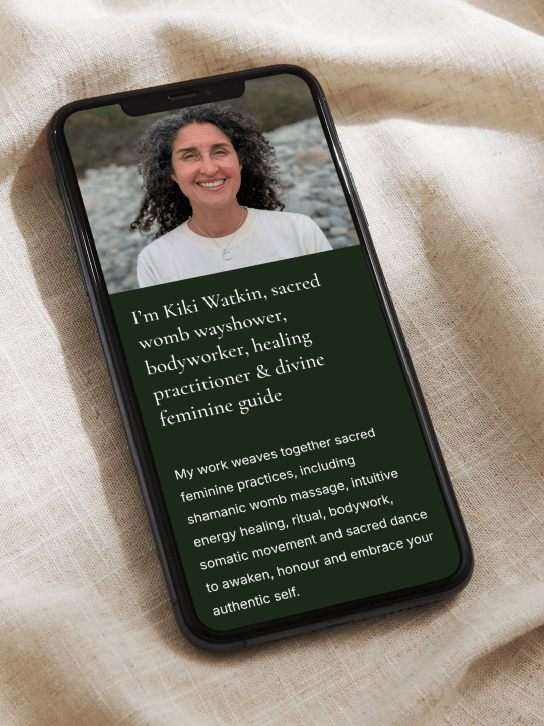
Kiki Watkin
Feminine Embodiment Practitioner
When Bristol-based Kiki Watkin approached me to create a website that could hold and reflect the depth of her feminine embodiment work and womb centred healing practice, I knew the project needed to balance sacredness with accessibility.
Together, we built a grounded, welcoming website that serves as an intuitive online home for her transformative work, offering clarity, beauty and flow.
Services
– Aligned Website Design

Challenge
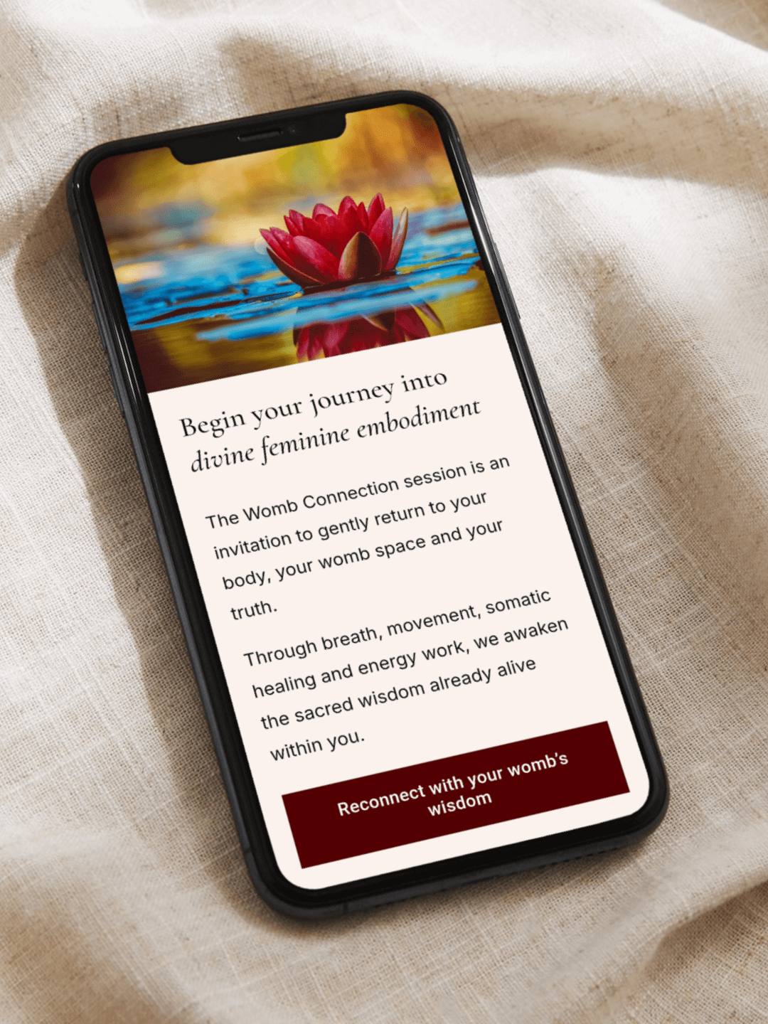
With 20 years of experience guiding women through sacred feminine practices, Kiki’s work focuses on reconnecting women to their innate wisdom and the forgotten power of the feminine. She wanted her website to mirror this ethos – sacred yet approachable – while making it easy for clients to explore her sessions and workshops.
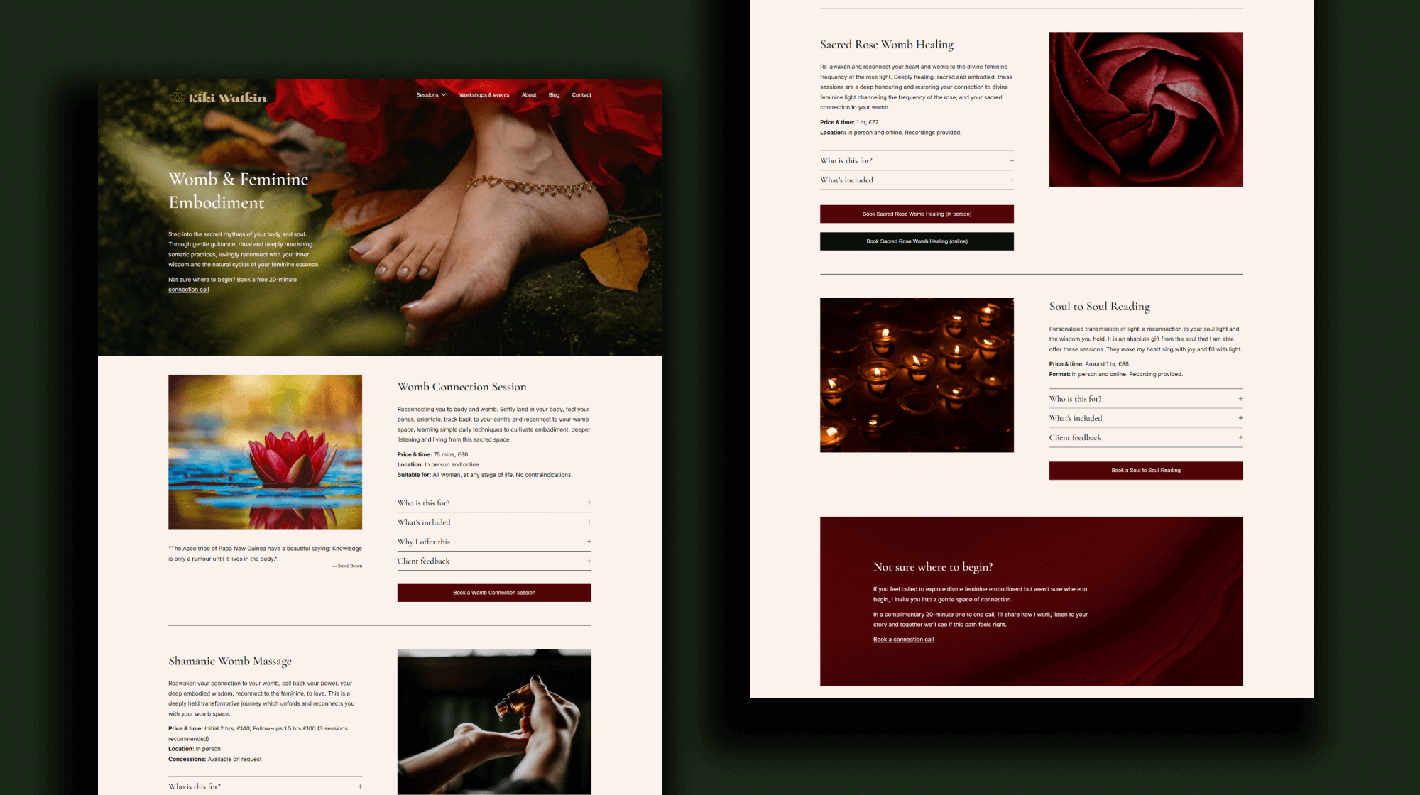
Kiki offers twelve one-to-one sessions alongside workshops, events and trainings that span pregnancy and postpartum care, trauma-informed healing and embodied feminine practices.
She needed a website that would:
Present her services clearly and accessibly so visitors could easily find their way through her diverse offerings.
Make her sessions easy to navigate without overwhelming new visitors.
Reflect the richness, depth and sacredness of her practice while remaining approachable.
Encourage visitors to book online or join her mailing list with gentle and clear invitations.


Approach
We began the process with several collaborative meetings, working through the Aligned Website Design strategic workbook that I provide to all clients. This framework allowed us to shape the site’s structure, flow and feel with intention, grounding the project in Kiki’s vision while also drawing on professional expertise in website design, marketing and user experience principles.
(Side note: clients working with me benefit from a 20% discount on their first year of Squarespace Website, Acuity Scheduling and Email Campaign subscriptions – annual plans only – thanks to my Squarespace Gold Circle membership.)
Service architecture: Kiki’s twelve one-to-one sessions were strategically grouped into three clear categories. Each category was given its own dedicated page to reduce overwhelm and help visitors explore things easily.
Events & training: A central Events page was created to highlight workshops, gatherings and trainings, enabling visitors to book directly.
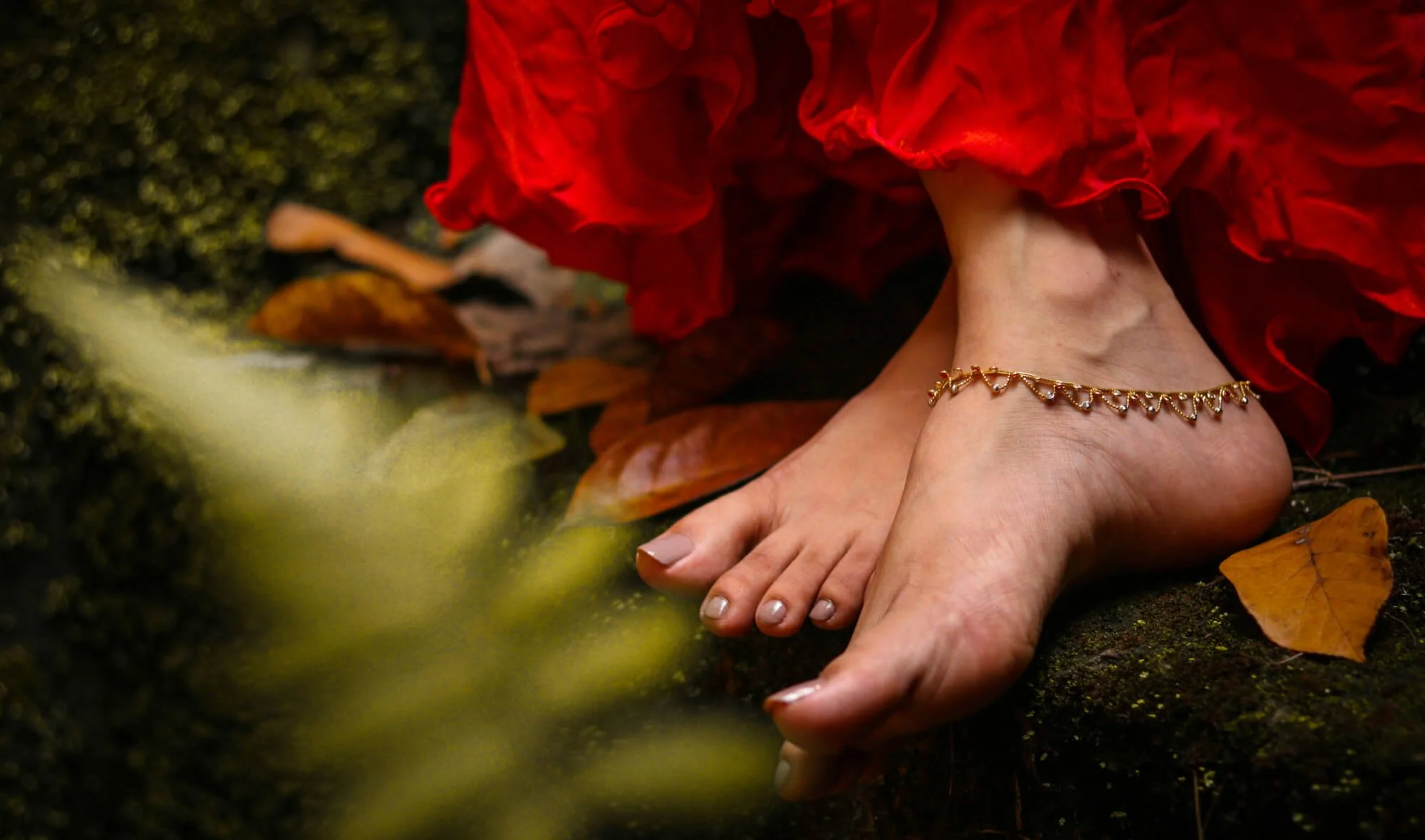
Visual storytelling & brand feel: The homepage hero section features a cave-like image creating an immediate sense of sanctuary. Supporting imagery including roses, trees, flowing fabric, hands, feet and lips, was sourced to emphasise embodied experience and reflect the brand personality: feminine, approachable, powerful and connected.
Colour palette & typography: Deep forest green, burgundy and black convey transformation and authority, while blush pink and cream bring softness and approachability. Typography balances elegance and readability, with Cormorant Garamond for headings and Inter for body text.
Bookings & email support: Acuity Scheduling and Email Campaigns was integrated for direct online bookings and email marketing needs.
Solution
The new website gives Kiki a cohesive, professional platform that clearly presents her full range of offerings and makes it straightforward for clients to explore and book. The design itself elevates Kiki’s visibility and positions her as an experienced, trusted practitioner.
Early client feedback has been very positive: Kiki shared that having a new website has been something she has wanted for a long time, and that taking this bold step forward feels both exciting and relieving. She described feeling grateful to finally have a platform that authentically represents her work and makes it easy for clients to access support.
____
Like Kiki, you can take the bold step toward a website that elevates your visibility and feels fully aligned with your work. I’d love to guide you through that process. Enquire here.